MYNDFUL: A Mental Health Resource Hub
The Problem
There are disparate ways of accessing information about campus-related resources that are applicable to QTPOC graduate students. Searching for relevant campus resources is currently labor-intensive, but having access to these resources may increase positive outcomes for students within this demographic.
Stakeholder Map

Key Stakeholders
- Primary: QTPOC Graduate students at UW, Mental Health Professionals, People looking to improve their mental health
- Secondary: UW Counseling staff, student groups at UW that represent LGBTQ+/BIPOC/Graduate students, School Faculty
- Tertiary: Inclusive therapists, Mental Health Organizations, The UW, QTPOC Graduate students outside of UW.
Contextual Inquiry
As a means to better understand the problem, five contextual interviews were conducted with primary and secondary stakeholders (four QTPOC graduate students and one mental health professional).
Key Findings:
Mental health resources are important to this community.
Time is a major barrier as a graduate student.
Physical space is important to mental well being.
Resources that are applicable to intersections of identity are valued.
Searching for and using mental health care resources is a process.
There are different approaches to mental health and many disparate places to find resources.
Connecting with community within and outside of school is important.
Check out the detailed contextual inquiry findings here.
Point of intervention
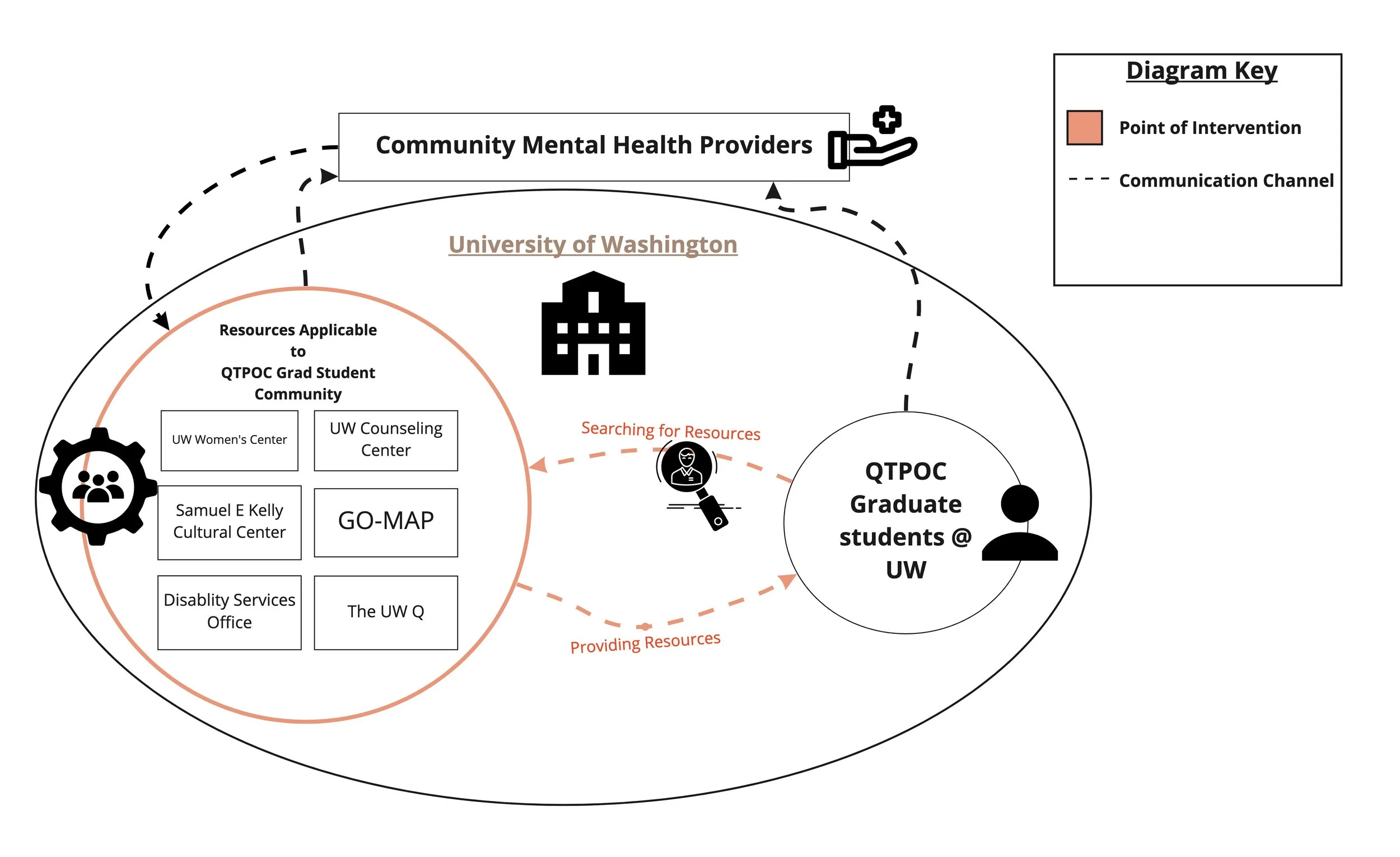
The specific point of intervention is located within the digital communication channels between resource providers and the community of interest looking for resources. The pink lines in the systems map above are representative of flows of communication between a centralized resource hub and members of the QTPOC graduate student community at UW.
The Solution
Creating mobile phone app to centralize resources applicable to QTPOC graduate students at UW would work towards solving the problem. This design aims to simplify the processes of resource navigation and resource compilation, allowing for greater accessibility and convenience.
Prototype
PROJECT OVERVIEW
During the Autumn 2021 quarter of my MS in Information Management program, I collaborated with two other graduate students to research and design an intervention that would address the needs of Queer and Trans People of Color (QTPOC) identifying graduate students at the University of Washington(UW) seeking mental health resources.
ROLE: Lead UX Researcher / Designer
DURATION: 10 Weeks
TOOLS: Figma, Miro, & Google Suite
MY CONTRIBUTION: conceptual research, systems diagram, stakeholder analysis, surveys, personas, contextual inquiry, lo-fi prototyping, think-aloud walkthrough, & usability testing


UsER Testing
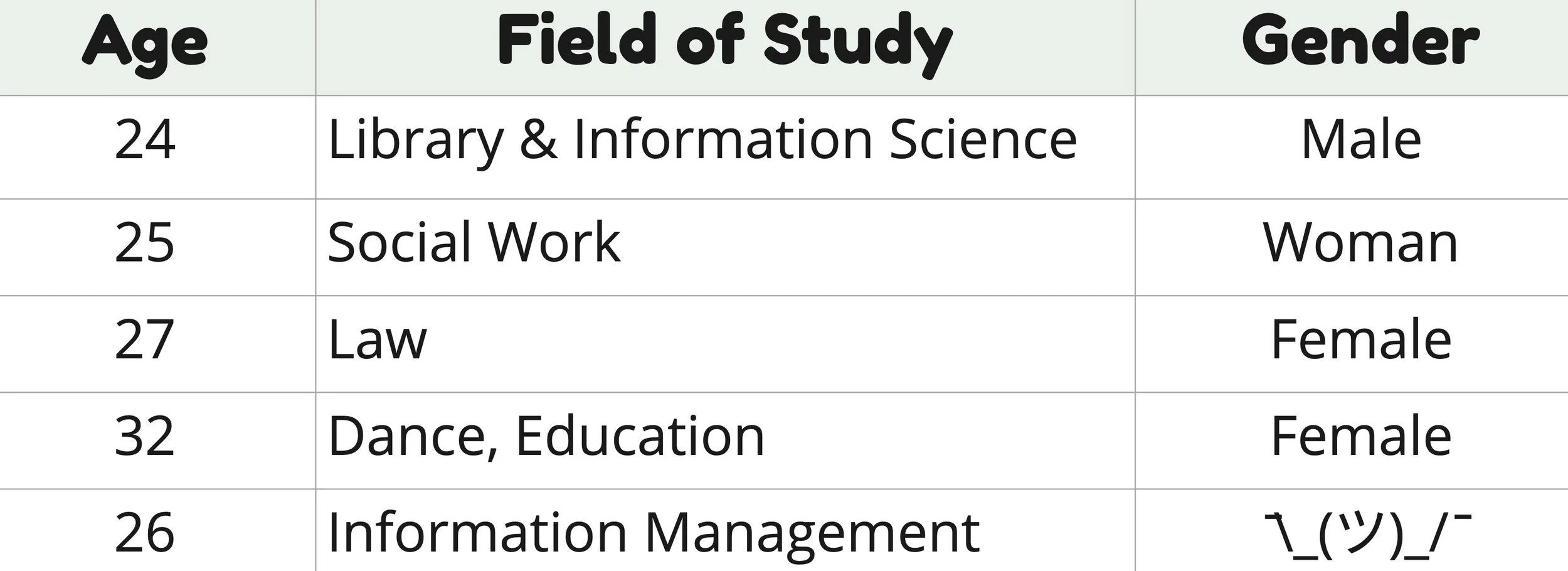
PARTICIPANT DEMOGRAPHICS
SURVEY FINDINGS
Question 1: Would you add or change any features?
The option to delete bookmarks when necessary.
A glossary page for what the Tile labels mean and what the UW resources do.
A Notes function to see what therapists have been contacted or to see what resources have been visited.
Anything to aid the User in the research process for finding, engaging, and retaining resources.
A calendar function to see what events/talks/outreach is occurring through themes of Identity, Community, Self-love, etc.
Question 2: What did you like most about the application?
Users like how it breaks down the overwhelming topic of "mental health resources" into manageable pieces.
It's intuitive in that people would know what icons do what (heart means to favorite resources and the phone icon will call).
Question 3: What did you like least about the application?
The lack of buttons and labels to add/delete bookmarks and undo actions.
The application looks visually crowded and can improve in sizing and spacing.
Question 4: How can we as a team improve the application?
Adding a direct function to connect with Mental Health professionals.
Have the team speak directly with Mental Health professionals and resource staff to understand how their processes are performed and how we can use design to combat these challenges.
WALKTHROUGH FINDINGS
TASK 1: Navigate the onboarding and select three Word Tiles that best apply to you.
Our participants had issues finding the "Continue" button when selecting their Word Tiles.
They wished the "Continue" button was more visible to mitigate errors in navigation and uncertainty.
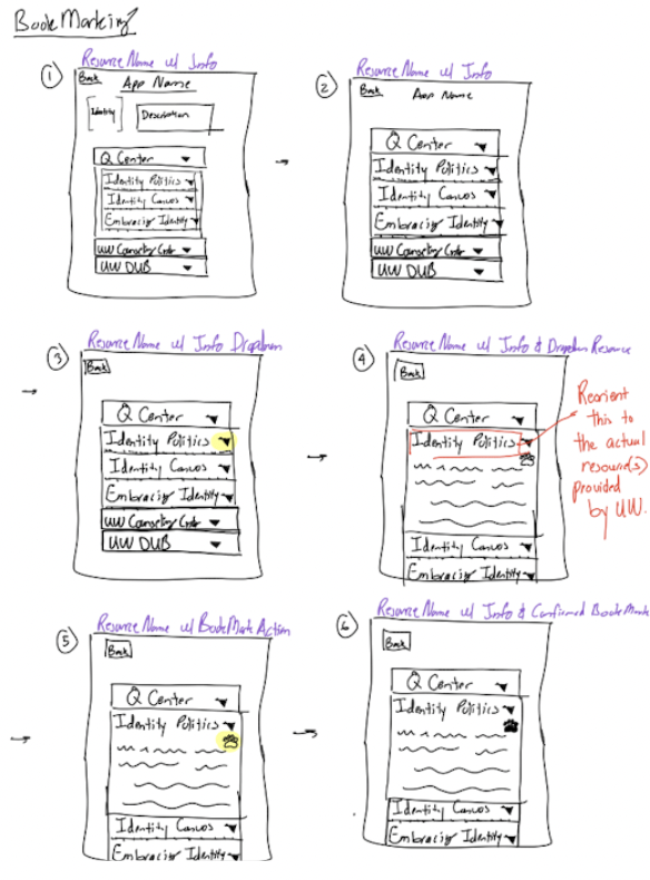
TASK 2: Bookmark the Q-Center's "Queer Mentoring and Peer Program" resources page under the Identity Tile.
Participants didn't know what the dropdown menus meant and how they related to the resource.
Difficulties in bookmarking existed because the heart icon was too light and small to see.
TASK 3: Refer to your bookmarks page and access your recently bookmarked resource.
The overall process was intuitive and easy to follow.
Participants knew which icon was the favorites button since the heart icons are used for the bookmarked resources and page.
TASK 4: Call the crisis hotline from the application.
The process was intuitive and easy to use.
Participants wished there was a confirmation before the call would be made to prevent "butt-dial" situations.
TASK 5: Go to the select new tiles page.
Participants didn't know what the "+" icon meant in the bottom navigation.
They wished the icon represented how the Tiles look ([+]) for consistency.
REFLECTION: Challenges & Limitations
There are only so many mental health resources that can be represented and launched.
We must be cognizant of what resources we are representing and providing when engaging with our concept.
It was difficult to get input from Mental Health care providers and people who manage the resources we are interested in.
Ideally, input from resource mangers is essential to the realization of this type of design.
Having conversations with Mental Health professionals about QTPOC student use with these resources is limited.
In the development of our contextual inquiries, a professional's capacity is restricted to their work. We must be respectful of that.
Our design concept will increase the workload and capacity of mental health providers and resources if used.
Because we are providing attention and mitigating navigational errors, workloads will increase once people seek them out.
QTPOC experiences with mental health, identity, and navigating institutional spaces are complex and never universal.
FUTURE WORK
The insights yielded from this study emphasized the importance of understanding the interconnected systems that impact access to mental health resources. While this initial research focused heavily on gaining a better understanding of the needs of QTPOC graduate students, the design solution would benefit from additional insights regarding resource administrator / provider constraints & needs. With this in mind, the next steps in developing a more robust and sustainable iteration of this design solution involve the following:
Competitor Analysis
Secondary research on provider needs & constraints
Subject Matter Expert surveys & interviews